Thursday, December 2, 2010

Thematic Map

Thematic maps are useful for understanding specific topics and often rely on chloropleth map characteristics to get across their messages. This one is conveying the average temperatures across Australia. It uses colors to indicate where high average temperatures are located and low temperatures are located.

http://www.bestcountryreports.com/Temperature_Map_Australia.html

Mental Maps

Mental Maps are often rough, crude drawings with little attention payed to scale and rely on an individuals mental picture of the area. These types of maps are not to be relied on for scientific or statistical data but are most helpful for directions or knowing a rough layout of an area.

http://www.fedstats.gov/kids/mapstats/concepts_mentalmaps.html

Hypsometric Map

Hypsometric maps are used by cartographers to illustrate changes in elevation. This is achieved by using different colors to represent different heights and then shading appropriately. This map shows a region of France and how near the rivers mouth the elevation is low.

http://www.reliefshading.com/colors/hypsometric.html

Univariate Chloropleth Map

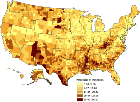
This map depicts poverty in the United States. It uses the baseline lowest level of poverty to set where the darkest color should be and then usually gradually lightens the color. It shows that areas in the Arizona and Texas have the highest percentages of poverty.

http://www.cdc.gov/pcd/issues/2007/oct/07_0091.htm

Propaganda Map

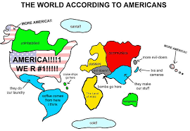
Propaganda Maps are most often used to depict a certain areas view of what they think about the world. In this case the map is favorable to America and shows the rest of the world as beneath us. It is not at all an accurate representation of the world but shows a common view of many Americans.

http://kansieo.com/2008/04/08/the-world-according-to-texans/

Prism Map

This is a prism map representing West Nile Virus cases in the United States. This type of map is nice cause it allows for easy assumptions to be made when one looks at it. It uses colors to indicating number of cases but also uses the height of the states to indicate which has more cases. This map also shows that the misconception that gulf states were the most vulnerable it was in fact the upper midwestern states that were at most risk.

http://www.goldensoftware.com/products/mapviewer/mapviewer-maptypes.shtml

Range graded proportional circle map

Range graded maps deal sets the standard for the size of the distribution bubbles by subtracting the largest population time from the smallest size. This allows for a nice equal distribution and realistic sized bubbles to the population size. Also as you notice the bubbles are proportional to the population size due to the range set.

http://www.neiu.edu/~jrthomas/377/circle.jpg

Thematic Maps

This map deals with the population density of Japan. It uses influences from chloropleth maps to show that Japan's cities are very densely populated. It also shows that Japan is very densely populated in the cities and that the country side is also populated but not nearly densely populated as the urban areas.

http://www.bestcountryreports.com/Population_Map_Japan.html

Box Plot

Box plots are useful for understanding data in terms of median and other statistical data types. In these types of plots you can begin to understand all the data. It allows you to see the distribution of the data. They are especially useful when seeing if there are any outliers.

http://edubuzz.org/blogs/nbhs3x1/2007/01/08/8-jan-2007-five-figure-summary-and-box-plots/

Dot Distribution Map

Dot distribution maps deal with the density of the data sets. This map deals specifically with bird citings in North America. These types of maps can be useful when trying to figure out densities of populations.

http://www.birds.cornell.edu/pfw_fr/Members/ParticipantMap00.htm

Standardized Chloropleth Map

Standardized Chloropleth Maps use colors to depict percentages of a type of data in specific constraints. This one deals specifically with percentage of the population under the age of 14. In these types of data sets they set a standard where the lowest population percentage sets the standard.

http://www.statcan.gc.ca/pub/92f0138m/2008003/figures/5200001-eng.htm

Scatter Plot

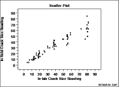
Scatter plots are used to plot data on an x and y axis. Often the data has two variables one that is controlled and one that is variable. This data can be fit to a trend line and from this you can often detect outliers once you run statistical analysis on it.

http://www.itl.nist.gov/div898/handbook/eda/section3/eda33q.htm

Correlation Matrix

Correlation matrixes are used to show relationships among a large data set. This can be helpful if one is trying to track genetic inheritances among an animal population as is depicted above. But can also be used for large human populations to track how they're moving in a specific geographic area.

http://www.livestockgenomics.csiro.au/Genome_to_Phenome/matrix32_blocked.png

Pie Maps

Pie maps can be used to show how the population is broken up. In this case it deals with how the population is broken up among the different counties. These maps could be useful when trying to break up the racial makeup of a certain area.

http://www.goldensoftware.com/products/mapviewer/mapviewer-maptypes.shtml

Index Value Plot

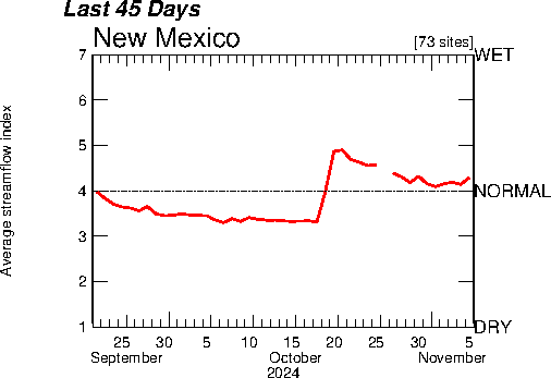
Index value plots show the differences between two extremes with the normal being placed in the middle. In this case it is being related to stream flow and where normal lies. This type of graph is helpful when it comes to showing anomalies in water flow over time. And also shows that for the most part the water flow has been closer to the dry side.

http://waterwatch.usgs.gov/?m=real&w=plot&r=nm

Digital Elevation Models

Digital elevation models are used specifically to get elevation maps into a digital 3-D image. This allows for greater analysis of the area and also lets you get a more realistic view of what the area looks like. It allows you to see anomalies that might other wise be missed because a flat elevation map might not show it as clearly.

http://www.landmonitor.wa.gov.au/default.aspx?id=5

Cartographic Animation

This map uses 3-D animation to depict changes in elevation for a specific area and how it relates to wind speed. This type of map can be used to understand the movement of winds within a weather system but also can be used to understand how the gain power through wind convection.

http://cartography2.org/Chapters/page6/OverviewAnimated.html

Histogram

Histograms are used to depict one type of data against two different parameters. This often results in data bars that are clustered along a certain area on a bar graph. This data is often normalized to meet statistical guidelines so that is best fits gaussian statistics.

http://www.wind-power-program.com/wind_statistics.htm

Isohyets

Isohyets are used to depict areas of equal precipitation. The areas along the lines show wehre equal precipitation is occurring. This can be useful so you can see where areas of low precipitation are. Also it can show how water is being distributed across an area and any measures necessary to counteract that.

http://www.bbc.co.uk/blogs/weather/ianfergusson/2010/06/formula-one-weather-forecast-c-1.shtml

Windrose

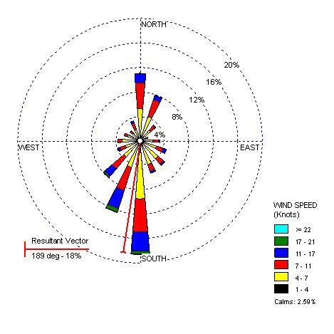
Windroses are used to determine the major directions winds are originating from. This can be useful for ships if they are reading ocean windroses so they know how to best angle their ships in transit. Also can be useful for future wind farms so they know the areas that are best to place their windmills and what direction.

http://www.climate.washington.edu/climate.html