Thursday, December 2, 2010

Thematic Maps

This map deals with the population density of Japan. It uses influences from chloropleth maps to show that Japan's cities are very densely populated. It also shows that Japan is very densely populated in the cities and that the country side is also populated but not nearly densely populated as the urban areas.

http://www.bestcountryreports.com/Population_Map_Japan.html

Box Plot

Box plots are useful for understanding data in terms of median and other statistical data types. In these types of plots you can begin to understand all the data. It allows you to see the distribution of the data. They are especially useful when seeing if there are any outliers.

http://edubuzz.org/blogs/nbhs3x1/2007/01/08/8-jan-2007-five-figure-summary-and-box-plots/

Dot Distribution Map

Dot distribution maps deal with the density of the data sets. This map deals specifically with bird citings in North America. These types of maps can be useful when trying to figure out densities of populations.

http://www.birds.cornell.edu/pfw_fr/Members/ParticipantMap00.htm

Standardized Chloropleth Map

Standardized Chloropleth Maps use colors to depict percentages of a type of data in specific constraints. This one deals specifically with percentage of the population under the age of 14. In these types of data sets they set a standard where the lowest population percentage sets the standard.

http://www.statcan.gc.ca/pub/92f0138m/2008003/figures/5200001-eng.htm

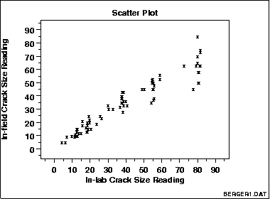
Scatter Plot

Scatter plots are used to plot data on an x and y axis. Often the data has two variables one that is controlled and one that is variable. This data can be fit to a trend line and from this you can often detect outliers once you run statistical analysis on it.

http://www.itl.nist.gov/div898/handbook/eda/section3/eda33q.htm

Correlation Matrix

Correlation matrixes are used to show relationships among a large data set. This can be helpful if one is trying to track genetic inheritances among an animal population as is depicted above. But can also be used for large human populations to track how they're moving in a specific geographic area.

http://www.livestockgenomics.csiro.au/Genome_to_Phenome/matrix32_blocked.png

Pie Maps

Pie maps can be used to show how the population is broken up. In this case it deals with how the population is broken up among the different counties. These maps could be useful when trying to break up the racial makeup of a certain area.

http://www.goldensoftware.com/products/mapviewer/mapviewer-maptypes.shtml